
Every once in a while an image needs some extra work in the darkroom to bring out the best that the print can be. While Photoshop (PS) can be used to output the image as a print, it can also be used to help map out what changes need to be made while burning, dodging, or evaluating contrast grade changes. The amount you darken corners or hold back a dark area can roughly be translated to the efforts applied in the projected image or contact print. If you darken a corner by “multiplying” in PS @ 100% opacity, that can roughly be translated to 1 stop burn of the corner. If you lighten an area in PS with a screen/lighten mode with 20% opacity, that would indicate you dodge for a similar percentage of time. Contrast changes are a bit more tricky but the use of levels or curves can help you visualize how a grade level change in the darkroom will be required, especially if split grade printing. You can also play with color in PS to mimic toning the image.
Example
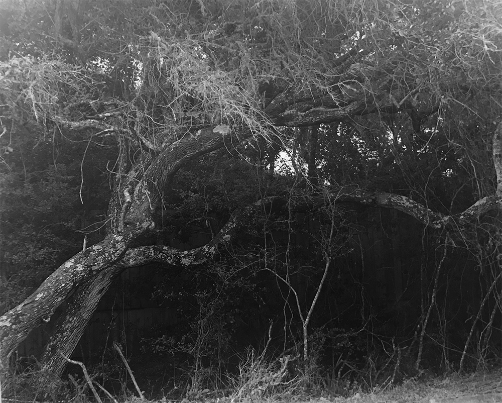
Iphone shot of the straight print
After a few tests I decided on grade 3 for 20 seconds gave me the overall starting point. After the print dried I photographed it with my iphone seven for further evaluation in PS.
– notice the haze on the left middle and upper part of the image, right upper, and lack of detail in the fence behind the tree. It is likely a mix of flare and humidity on the lens or negative or atmospheric conditions over a long exposure.
The PS revised image has the following changes:
Crop to 5×7 dimension to remove some of the top
Curves masking layers adjusted to bring down the high and middle tones upper left and right (Burn equivalent 1 stop left, 3/4 stop upper right, and 1 stop along the bottom).
Lighten layer to brighten the fence details 20% opacity – dodge 0.2 stops. Used the magic wand tool to select the similar adjacent tones in the fence.
Color added Hue and saturation – added a warm tone similar to Thiourea with 40A+60B mix.
Exposure increase 20% – This would translate to initially less time for enlarger exposure but it could also be due to the other layers in PS or the iphone capture.
Border added to simulate easel blades masking around the print – notice the warm tone however, so maybe use a warmer base paper too like Iford MG V RC Pearl Portolio.
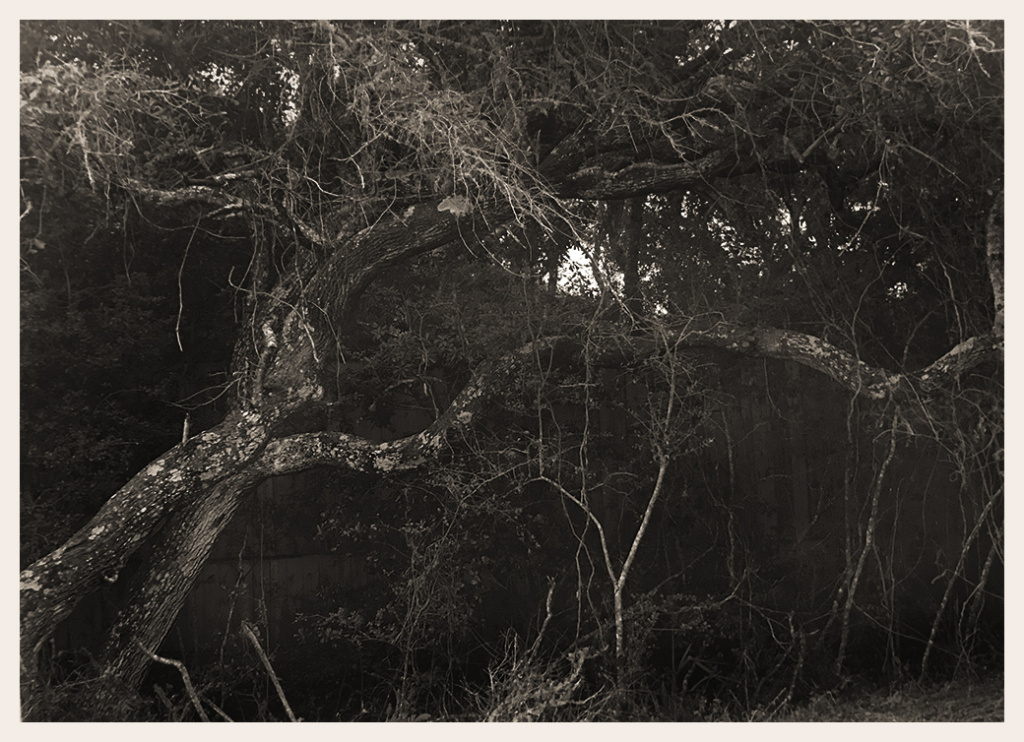
I’m not in love with this image but think it may be worth playing with in the darkroom to see if I can replicate what I did in PS. Will write the conclusion later
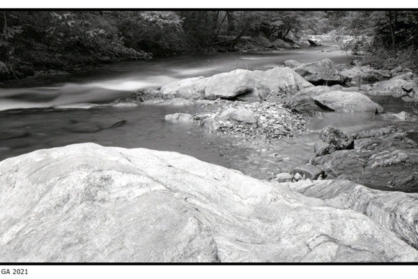
 Obsidian Aqua – Film test
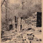 Toning with Espresso
 Winter Blahs